
Course focused on building a strategy to meet marketing communication goals with effective advertising across a variety of media.
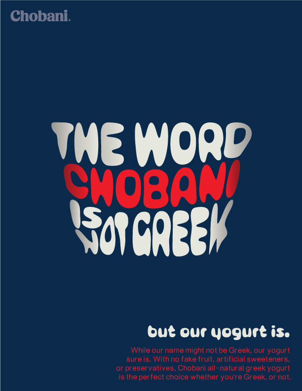
The challenge with the first project was to create an ad for Chobani using only text. While researching the brand, I came across a lawsuit; someone tried to sue Chobani because the word Chobani is not Greek and Chobani is a greek yogurt brand. Of course, Chobani won the lawsuit and was able to keep their name. In my ad, I decided to keep it simple and focus on the shape of the Chobani cup.

Our second project entailed creating a logo. It could be for ourselves or for a fake business. I decided to make a logo for the Sports department at the radio station I work for. At first I was thinking of incorporating a ball or sports equipment into the logo. However, as the radio station covers all sports, it seemed unfair to only feature a few sports items. Instead, I focused on the aspect that in most sports, you have to go fast. I decided to illustrate this using motion lines, typically found in comic books, to make the word "bombers" look like it's in motion.
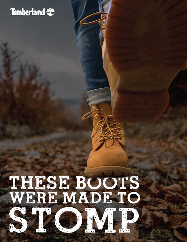
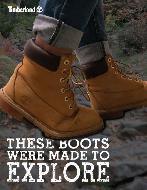
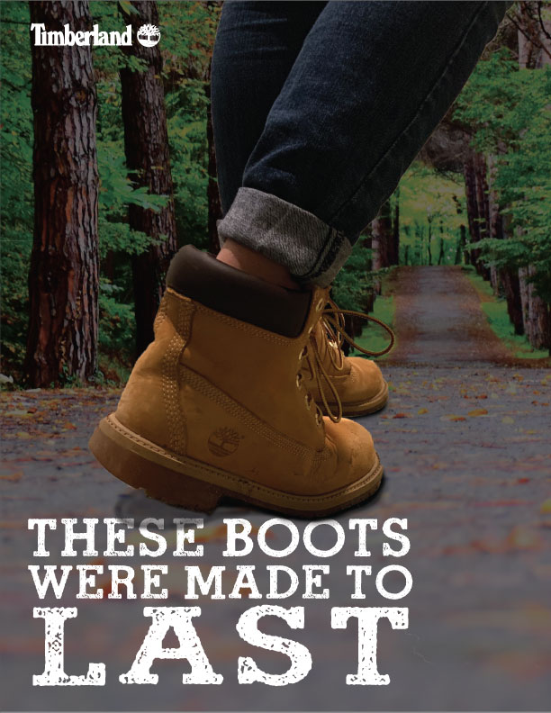
For the next project we explored how certain elements can make an ad appear loud or quiet and skew towards either male or female audiences. For these ads, I chose to use Timberlands. With these ads I focused on the idea that these boots will be with you, no matter what you do.
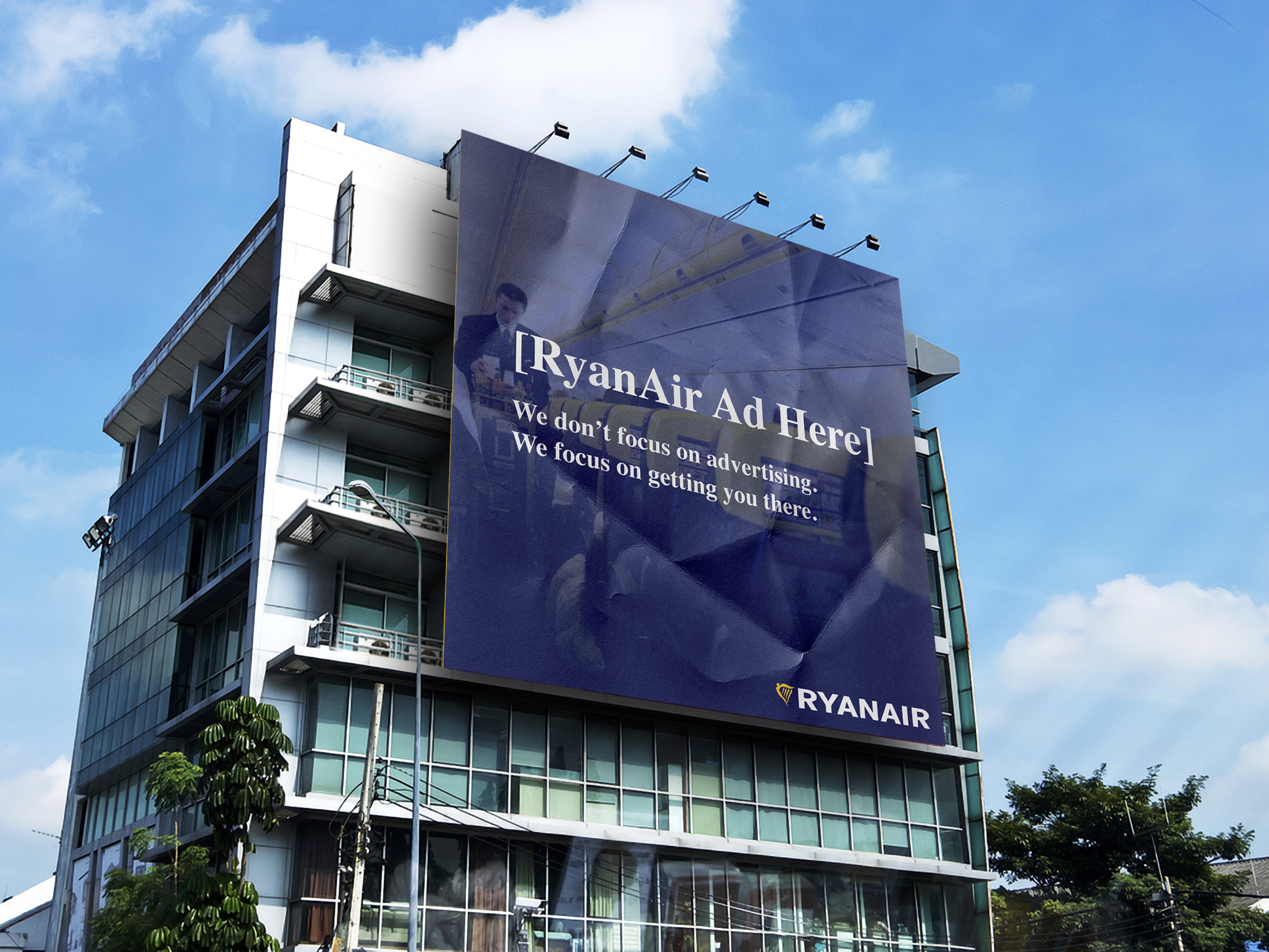
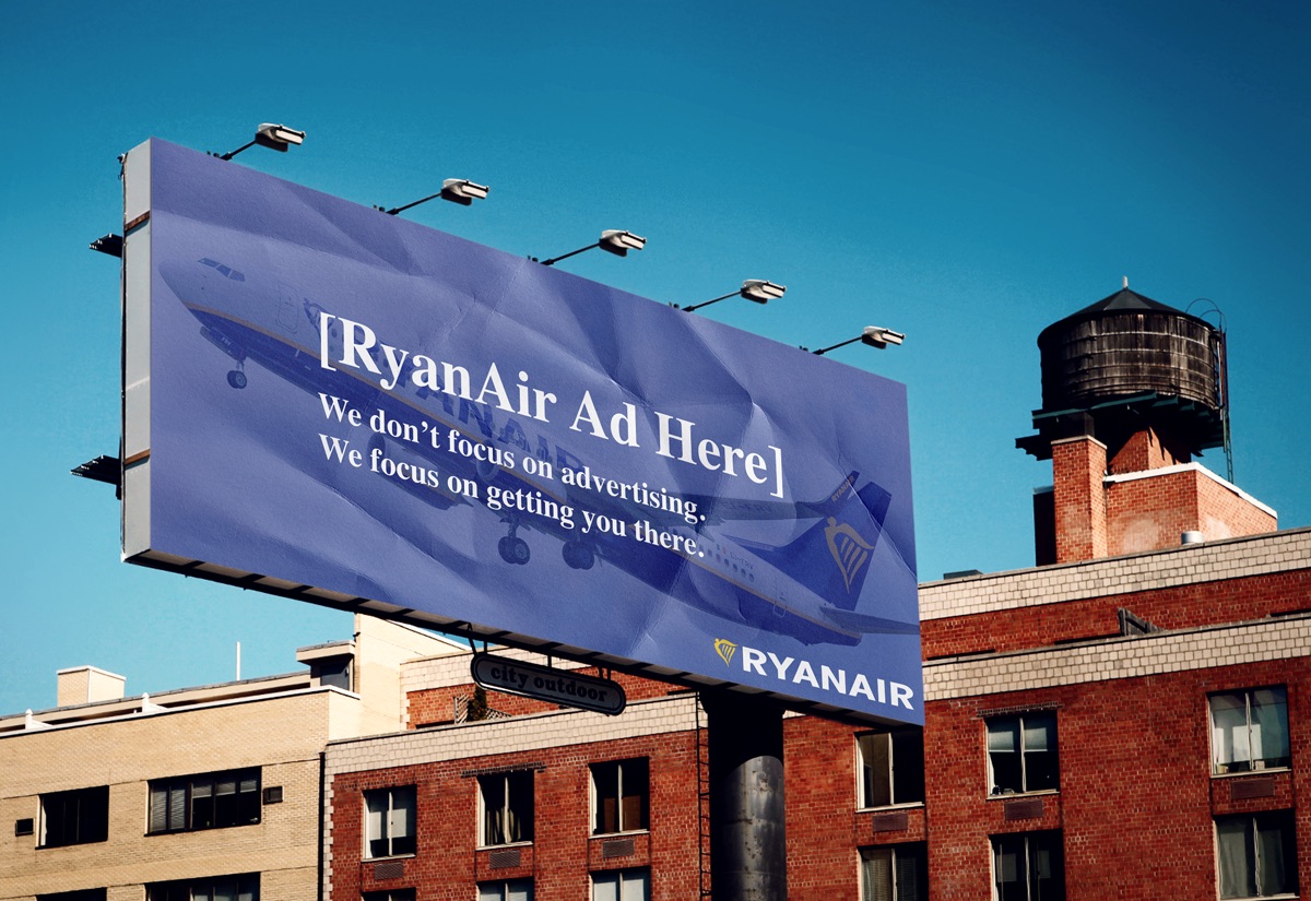
The next project involved choosing a travel company and making billboard advertisements. The challenge with this project was to make sure our ads would be able to be read by the average person driving by the billboard. This meant the copy had to be minimal and big. I chose RyanAir which is an airline known for not being the greatest. Therefore, I decided to bring humor into my ads by making them look unfinished and crumpled up, as though they were an afterthought.